“I saw a campaign for the first time, went to the landing page and instantly got curious if we could improve it.”
That is how most of our strategic thought experiments start.
Someone on our team spots a campaign out in the wild, gets personally interested, and immediately starts tearing it down in their head. A way to sharpen the hook. An alternative path to the conversion goal. A totally wild but high-converting layout concept.
Instead of letting it die in a Slack channel, we put our Claude credits to work and start building. Free-form experimentation drives native learning. If you want an agency that consistently breaks through performance caps, you need a team populated by people who optimize the world around them for fun.
Our latest playground? Redesigning Major League Baseball’s high-profile web campaign: Level the Playing Field.
MLB’s Economic Standoff
The campaign itself tackles a complex, high-consideration issue: the structural economics of modern baseball. As it stands, baseball is the only major U.S. sport operating without a hard salary cap, resulting in a staggering $446 million payroll gap between the highest-spending and lowest-spending clubs. MLB’s media push outlines a proposed 50-50 revenue split, a luxury-tax replacement, and hard salary floors to stabilize the sport.
It is massive data, highly political, and deeply dependent on fan sentiment.
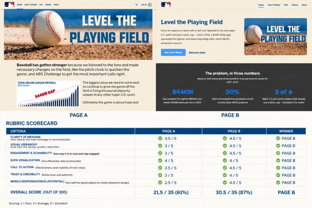
But when we looked at the deployment of the original campaign landscape (Page A), the strategic implementation hit a distinct ceiling. The message was buried, the visual entry points were chaotic, and the core call-to-action was faint. The original layout was chasing “conceptual brand wins” instead of driving a Measurable Business Outcome (MBO).
So, we built a conversion-first counter-proposal (Page B).
Page A vs. Page B
We didn’t just tweak the CSS; we ran a full comparative performance audit across seven rigorous structural design criteria. We built out a hard-coded prototype of Page B to prove out the UX logic against Page A.
When I say we, I mean here’s the prompt.
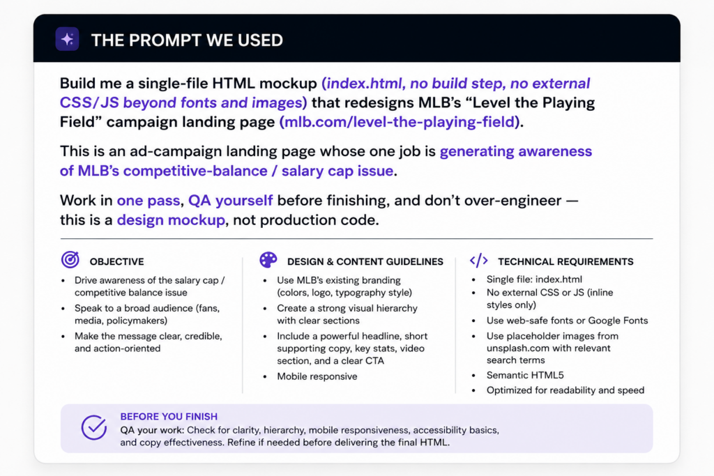
We let Claude run for 30 minutes, made a couple small tweaks ourselves and started reviewing through our performance criteria. We’d need an actual A/B spit test or user-tracking running to validate the actual winner, but based on the scorecards there was a clear clubhouse leader.
| Performance Criteria | Page A (Original) | Page B (Rebuild) | Projected Winner |
| Clarity of Message | 3.5 / 5 | 4.5 / 5 | Page B |
| Visual Hierarchy | 3.0 / 5 | 4.5 / 5 | Page B |
| Engagement & Scanability | 3.0 / 5 | 4.5 / 5 | Page B |
| Data Visualization | 4.0 / 5 | 4.5 / 5 | Page B |
| Call to Action (CTA) | 2.5 / 5 | 4.5 / 5 | Page B |
| Trust & Credibility | 3.0 / 5 | 4.0 / 5 | Page B |
| Mobile Responsiveness | 2.5 / 5 | 4.5 / 5 | Page B |
| Overall Performance Score | 61% (21.5/35) | 87% (30.5/35) | PAGE B |
Three Core Engineering Levers We Changed
1. Fixing the Visual Execution Gap
In the original asset layout (Page A), the primary graph was competing directly with an overwhelming, high-contrast header block. It lacked a clean entry point for a reader’s eye. On Page B, we established an immediate asymmetrical grid layout. The text copy commands the left side with a strong hierarchy, while high-vibe, contextual campaign imagery frames the right. The user instantly understands the vibe and the value within two seconds of landing.
2. Elevating the Data Infrastructure
The $446M gap is the villain of this story, and 50% revenue splits are the hero. Page A crowded these data points into standard prose blocks. On Page B, we isolated the statistics into a high-contrast, dark-mode “Problem Matrix” block. By extracting the core numbers—$446M Gap, 50% Player Share, and the 3-of-4 league benchmark—we created an unmissable visual hook that gives context to the subsequent interactive chart.
3. Moving the Conversion Needle
The ultimate purpose of a campaign landing page is to convert interest into a Measurable Business Outcome. Page A hid its interaction points. Page B features highly visible, high-contrast interactive blue CTAs (“See How It Works”) placed firmly above the fold, supported by clean, secondary underlines leading directly to deeper explanatory video content. We removed the friction between curiosity and action.
Why This Matters for Mid-Market Budgets
If you are a Marketing Manager managing a $20K+ monthly media spend, this thought experiment isn’t just a baseball critique. It is a window into how we look at your current assets.
Most agencies inherit a client’s landing page and blindly throw ad traffic at it, blaming the platform algorithms when the conversion rate plummets. We don’t accept performance caps. We analyze the structural relationship between your ad creative and your conversion backbone.
If there is a technical leak in your funnel, we don’t just find it. We deploy the strategic ingenuity and technical proficiency to build the bridge over it.
Stop running traffic to broken frameworks. Design campaigns that deliver outcomes instead.